Unlock Smarter Decisions with Power BI: The Power of Visual Analytics in Data Transformation

Introduction
In today's data-driven world, making informed decisions quickly is more crucial than ever. One of the best ways to achieve this is through data visualization, and Power BI is a powerful tool to help turn raw data into meaningful insights. In this blog, we’ll explore how visual analytics can drive decision-making and how Power BI can streamline this process for better business outcomes.
The Importance of Data Visualization in Decision-Making
Data visualization is a crucial step in the decision-making process. Here’s why:
- Clarity: Data is often complex, but visual representations like charts and graphs simplify it, making it easier to understand at a glance.
- Quick Insights: Visualization allows decision-makers to grasp key metrics in real-time and act without delay.
- Storytelling: Visuals help you tell a compelling story with your data, highlighting trends and key takeaways that text alone cannot convey.
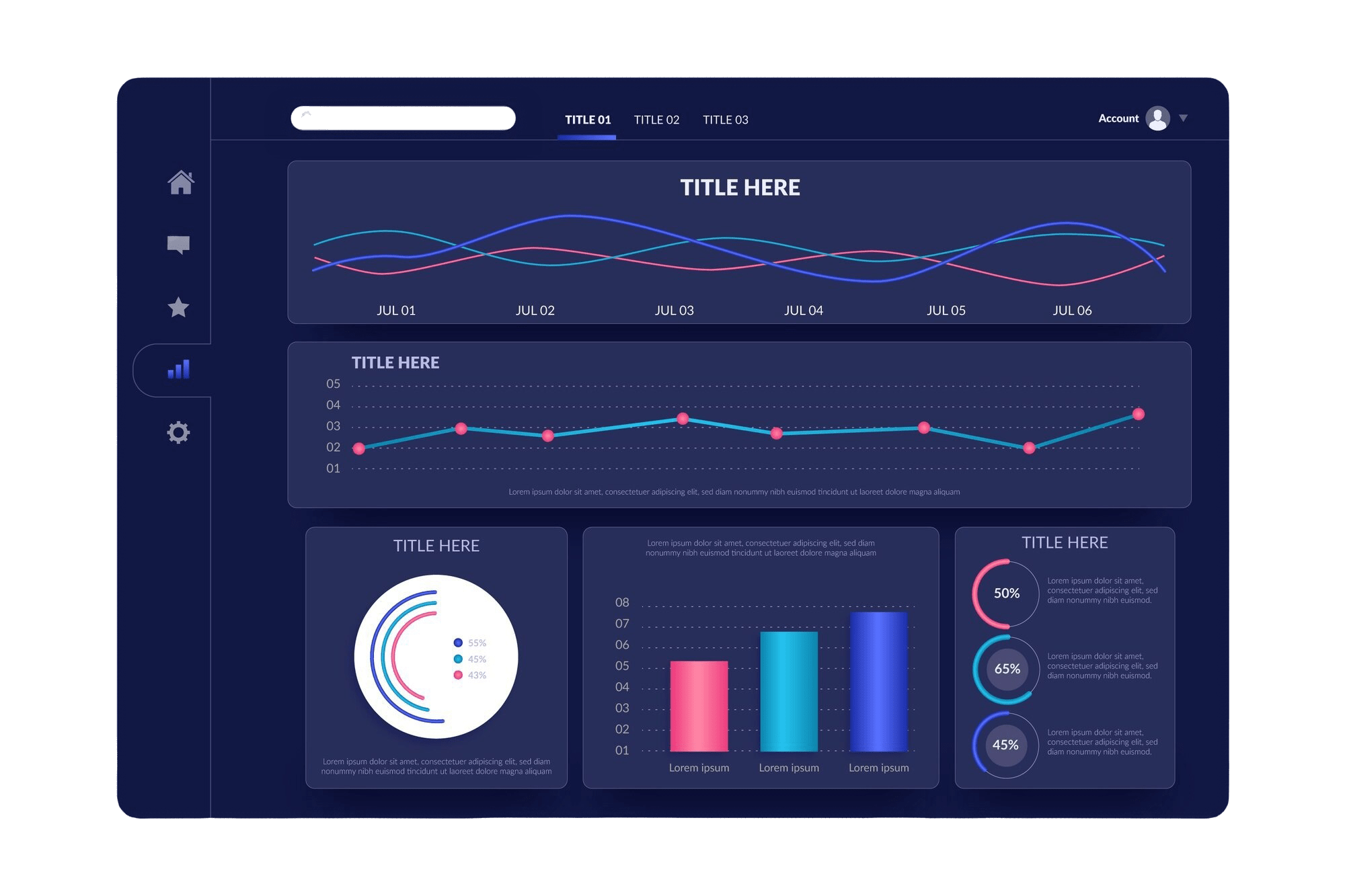
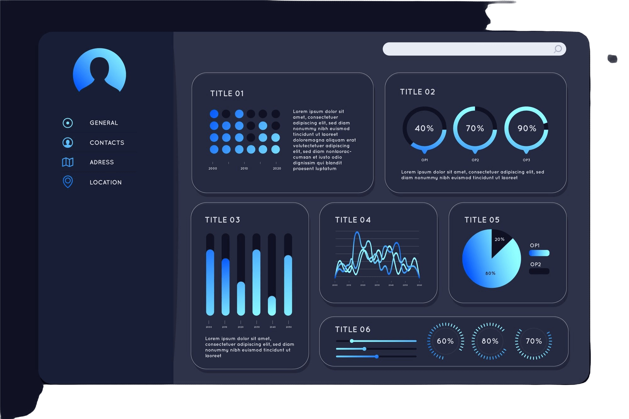
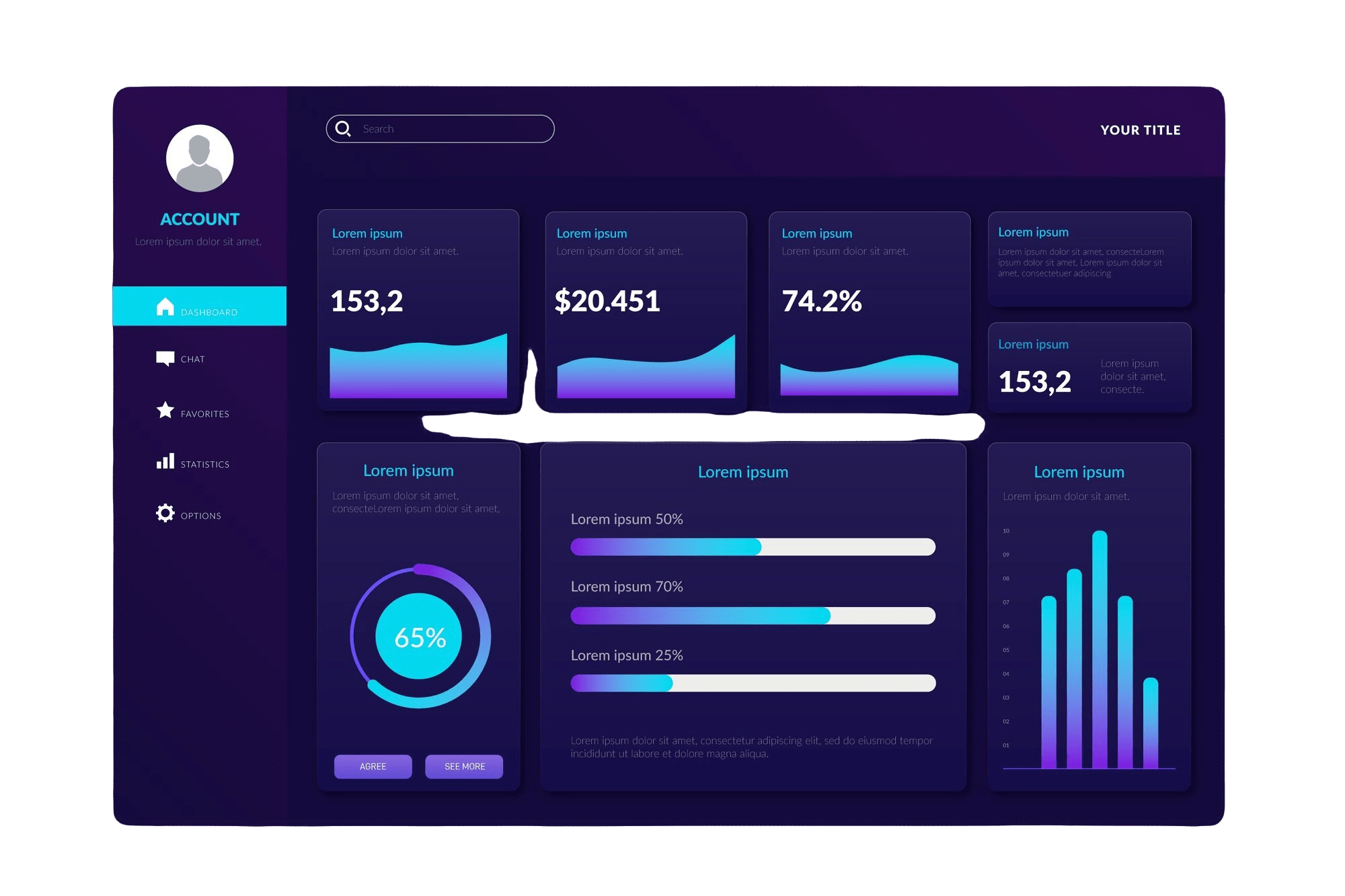
My Projects: Bringing Data to Life with Power BI
Here are a few examples of how Power BI has helped transform complex data into actionable insights for better decision-making:
1. COVID-19 Data Insights
In one project, I used Power BI to create dynamic dashboards showcasing COVID-19 statistics. From population data to global case trends, the visualizations helped stakeholders track the virus’s spread and adjust decisions quickly.
View Project2. Sales Performance Dashboard
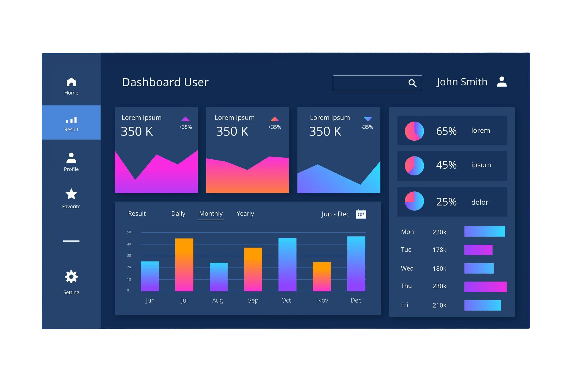
For a sales team, I built a comprehensive Power BI dashboard, combining data from various sources. Key metrics like sales performance, profit margins, and product distribution were all brought to life through interactive visuals. This allowed management to make real-time adjustments to their sales strategy based on live data.
View Project3. Global Superstore Report
Another project involved creating a Power BI report for a global superstore, which included data on product performance, profits, and sales by region. The clear, actionable visuals helped the company’s leadership make decisions on inventory management and market expansion.
View ProjectTips for Creating Impactful Dashboards in Power BI
To make your Power BI dashboards more effective, keep these best practices in mind:
- Focus on Key Metrics: Limit the number of visuals to the most essential data. Overloading your dashboard can confuse users.
- Use Dynamic Filters: Incorporate slicers and filters to allow users to drill down into data and extract the insights they need quickly.
- Leverage Consistent Color Schemes: Choose a color palette that helps convey the message of your data. Avoid using too many bright colors.
- Tell a Story: Every data point should contribute to a bigger picture. Organize visuals in a logical flow, guiding the viewer from one insight to the next.
- Design for the Audience: Always tailor the dashboard to the audience's needs. A sales team needs a different layout than an executive team.
Conclusion
With the power of Power BI, transforming data into decisions is not only possible but also efficient. By using the right visualization techniques, you can uncover insights, identify trends, and make smarter decisions faster. Whether it's a global sales report or a health data dashboard, Power BI makes data-driven decision-making easier and more impactful.
It looks Fascinating.